
Work / Premier Inn concept
Turning everyday checkouts into guest reviews.
At a Premier Inn in Somerford I noticed guests walking straight past the review prompts at checkout. This is a self-initiated UX proposal: I audited the existing touchpoints, looked at the evidence on reviews, and redesigned the checkout signage and the path to leaving feedback.
Problem
The review prompts were placed too low, the text was too small and they were off-brand, so guests rarely noticed them.
What I did
A touchpoint audit, research on reviews, and new signage with clear hierarchy, brand colours and a QR code that goes straight to the review.
Status
Concept proposal. Success would be measured as review volume per 100 checkouts, compared before and after.
Why it matters
Reviews drive bookings
Guests are happy to give feedback, but only if asking is visible, easy and well timed. Checkout is the ideal moment, and it was being wasted.
Audit
What was going wrong
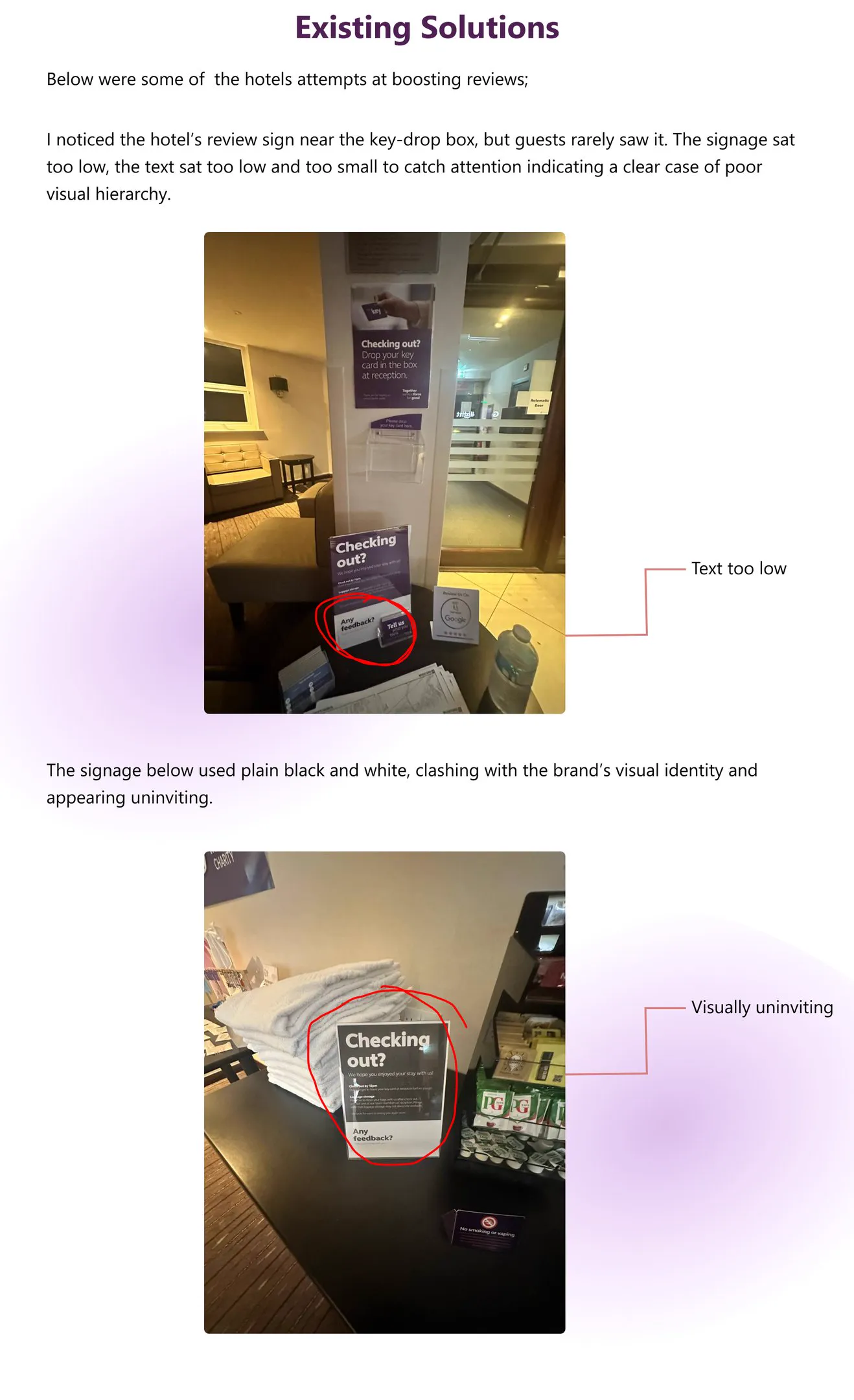
- Poor visual hierarchy: the review prompt was at the bottom of the sign, below the key-drop instructions.
- Off-brand: plain black-and-white signs looked uninviting next to Premier Inn's purple.
- Too many steps: no direct path from "I'd leave a review" to the review form.
Redesign
Proposed design
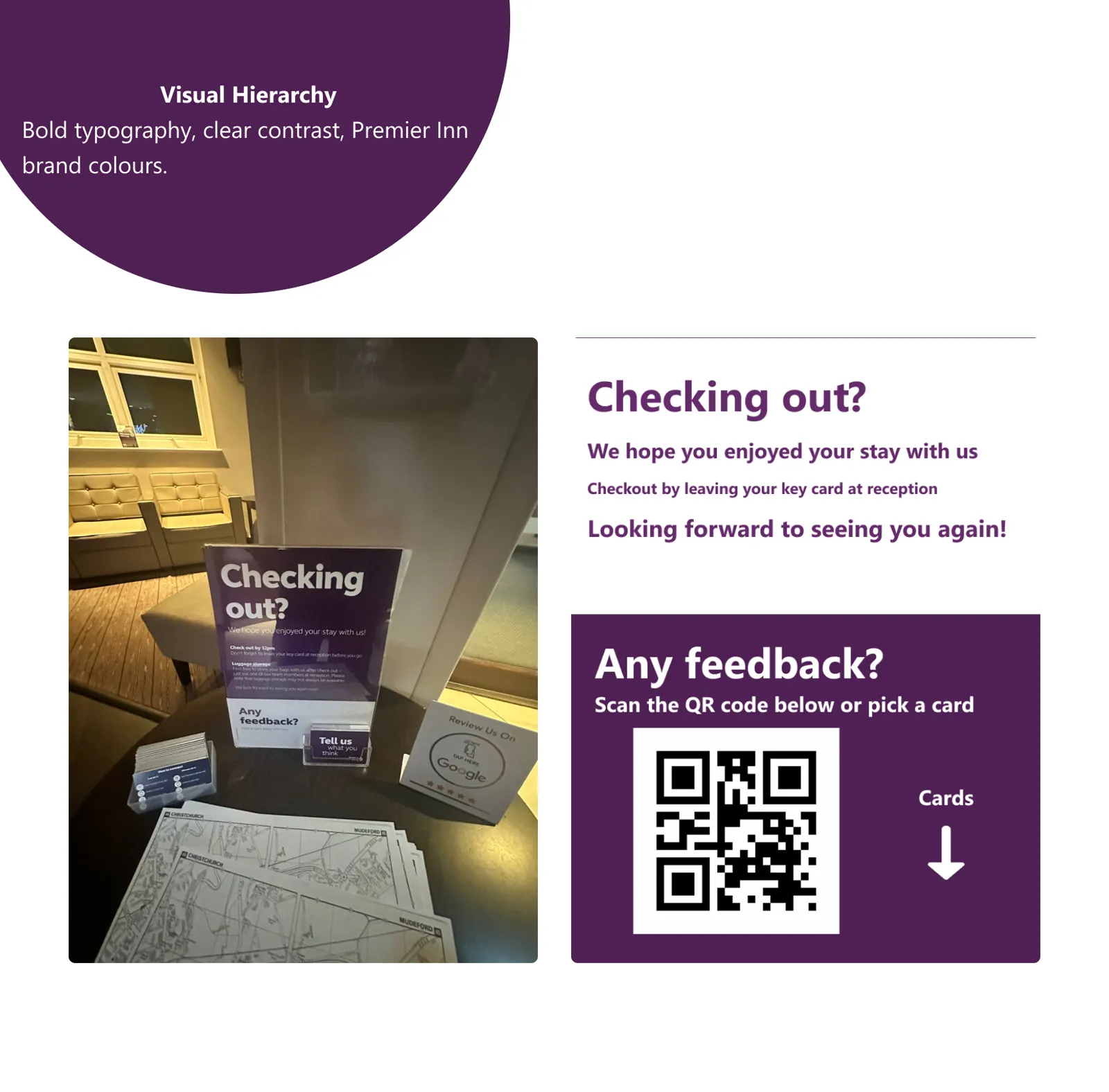
The key-drop instruction and the review prompt each get their own clear heading. The feedback panel offers two ways in: scan a QR code that opens the review form directly, or take a card to do it later. That suits both guests in a hurry and those with time to spare.