
Work / Baller
Making a mobile game players wanted to keep playing.
Baller is an endless ball-runner from Brainiac Dev, the game studio where I'm Product Designer. Early players told us it looked outdated, made their phones hot and had a tutorial nobody remembered. I led the redesign, from brand to menus to onboarding, and took it through Google Play's closed testing to launch.
Problem
Players found the UI dated, devices overheated after a few minutes, and most players misunderstood or forgot the tutorial.
What I did
New brand identity, a redesigned home and mode selection, power-up tips shown at the moment they matter, and lighter UI assets.
Outcome
Passed Google Play's 14-day closed test and got production access. The game is now live on Google Play.
Research
What players told us
I didn't want to redesign based on taste. I combined three sources: player feedback from our tester community, in-app analytics, and device performance data. Together they showed three main problems:
"The game looks outdated and my phone gets really hot after playing for a few minutes."Player feedback
"I skipped the tutorial because it was too long. Just let me play!"Beta tester
"I don't remember what this power-up is for."Player tester
The overheating finding changed the brief. It wasn't only a visual problem. A heavy, over-animated UI was making the game physically uncomfortable to hold, so performance became a design requirement, not just an engineering one.
Design
Key decisions
Before
A dated look with no clear identity, which made players feel the game wasn't worth their time.
After
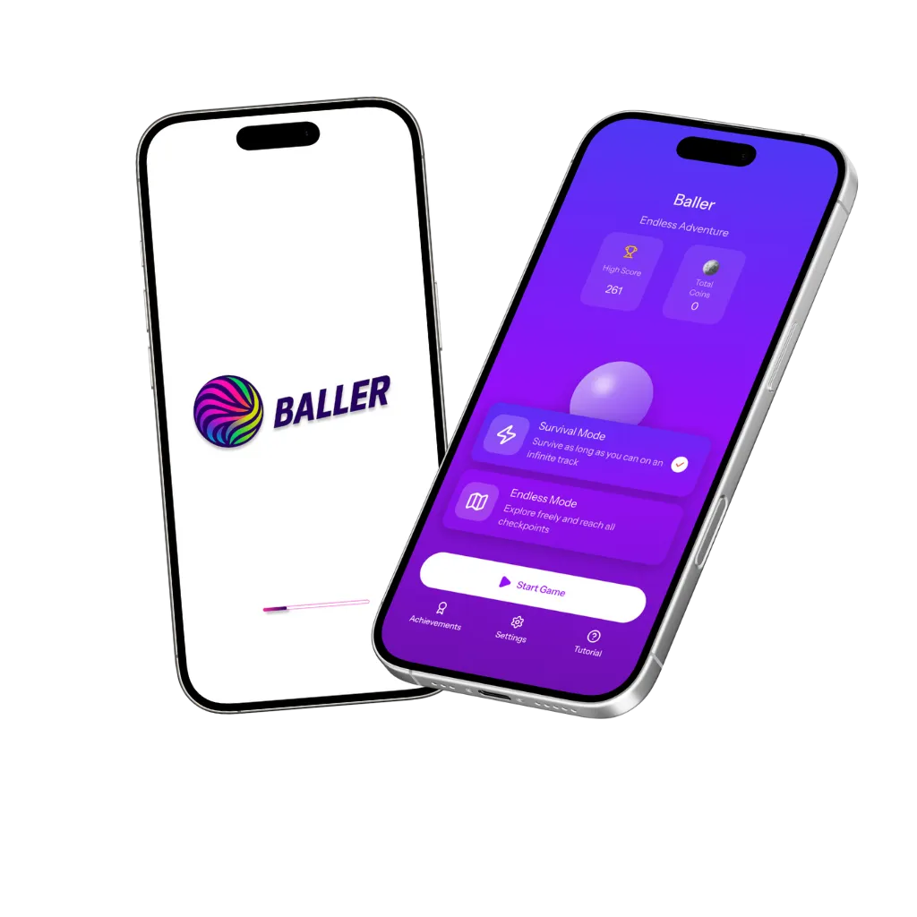
A new brand: a kinetic, multi-colour ball mark and a bold italic wordmark, carried into a purple-gradient UI with soft glass cards. It looks modern and energetic and stands out on a crowded store page.
Before
A long tutorial up front that players skipped, then forgot.
After
Learn at the moment it matters: each power-up (Coins, Shield, Magnet) gets a short tip card the first time you pick it up, and the full tutorial stays one tap away in the bottom bar.
Before
Cluttered menus between runs slowed players down.
After
One clear home screen: high score and coins at a glance, two clearly described modes (Survival, Endless) and a single primary "Start Game" button. Achievements, Settings and Tutorial sit in the bottom navigation.
Before
Heavy images and constant animation made devices overheat.
After
Performance-aware UI: I worked with the developers to cut asset weight and keep animation for moments that need feedback, so the game stays smooth and cool on mid-range Android phones.

Testing
Testing with real players
Google Play requires new developer accounts to run a 14-day closed test before a game can go public. Google monitors crashes, freezes and real usage during that window. I treated it as a usability study rather than a box to tick.
- Built a tester community: a 13-member player group where we shared new builds and collected feedback every day.
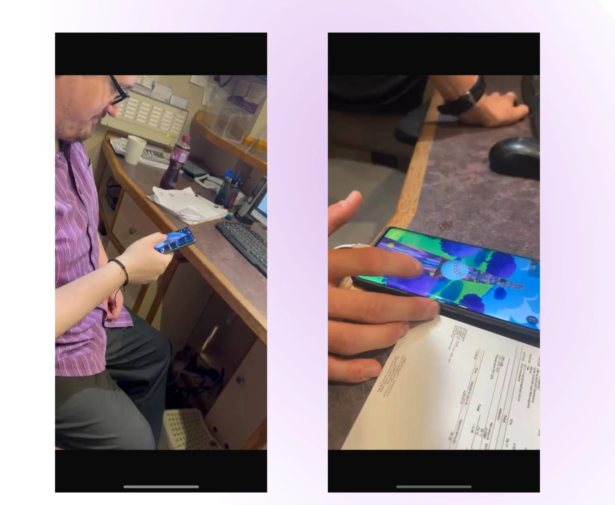
- Watched people play in person, on their own phones, to see where they hesitated, what they tapped and when they gave up.
- Iterated in short loops: feedback → design change → new build, until the problems were gone.
Outcome
Results
- Passed Google Play's 14-day closed test and was granted production access.
- Launched publicly on Google Play as Baller: Endless Ball Runner ↗ and passed 100 downloads. An iOS version is planned next.
- The redesigned onboarding replaced the long tutorial nobody remembered with short tips that appear in play.
What I'd do next
Track tutorial completion and day-1 and day-7 retention before and after the change, and A/B test how the power-up tips are worded. I'd also run a quick accessibility pass on colour contrast for players with colour-vision deficiency, since the game uses bright neon colours.