
Work / Ntem
Getting medicine to patients faster.
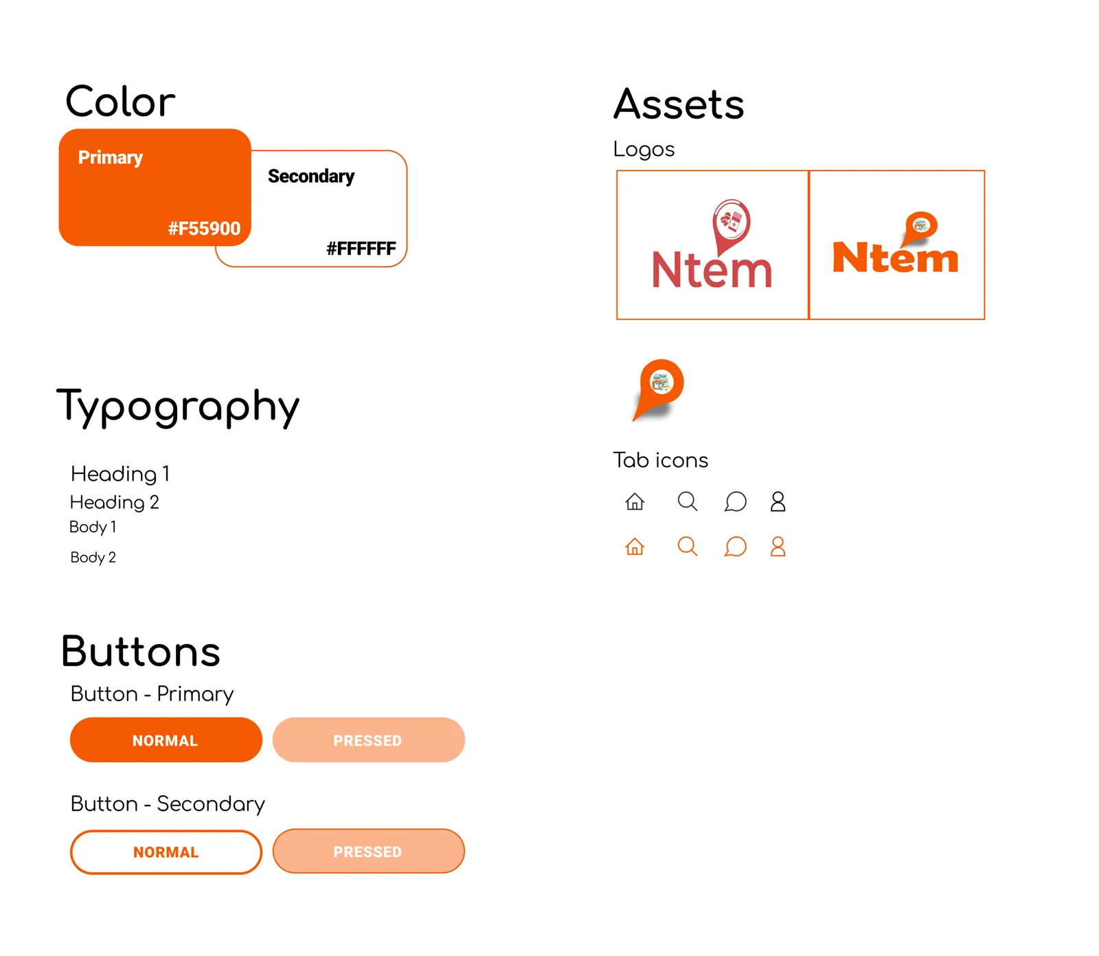
Ntem connects patients with pharmacies: consultations, ordering medicine, delivery tracking and medication reminders. As the sole UI designer during my internship, I turned the research team's findings into the app's interface, logo and design system.
Problem
Patients struggled to get timely consultations, buy medicine online and track deliveries.
What I did
Mapped the key journeys, sketched wireframes, built high-fidelity Figma prototypes and a design system.
Outcome
A complete, accessibility-led UI handed to development. The app didn't launch, but the work shaped how I design today.
Process
From research to UI
I worked closely with the research team, going through user interviews and behavioural insights. Patients' main pain points were reaching a consultation in time, buying medicine online and knowing where their order was. Stakeholders included patients, pharmacists, healthcare providers and developers.
The UI goals: an accessible, clear interface, intuitive navigation that works under stress (people using a health app are often unwell or worried), and a trustworthy visual identity.
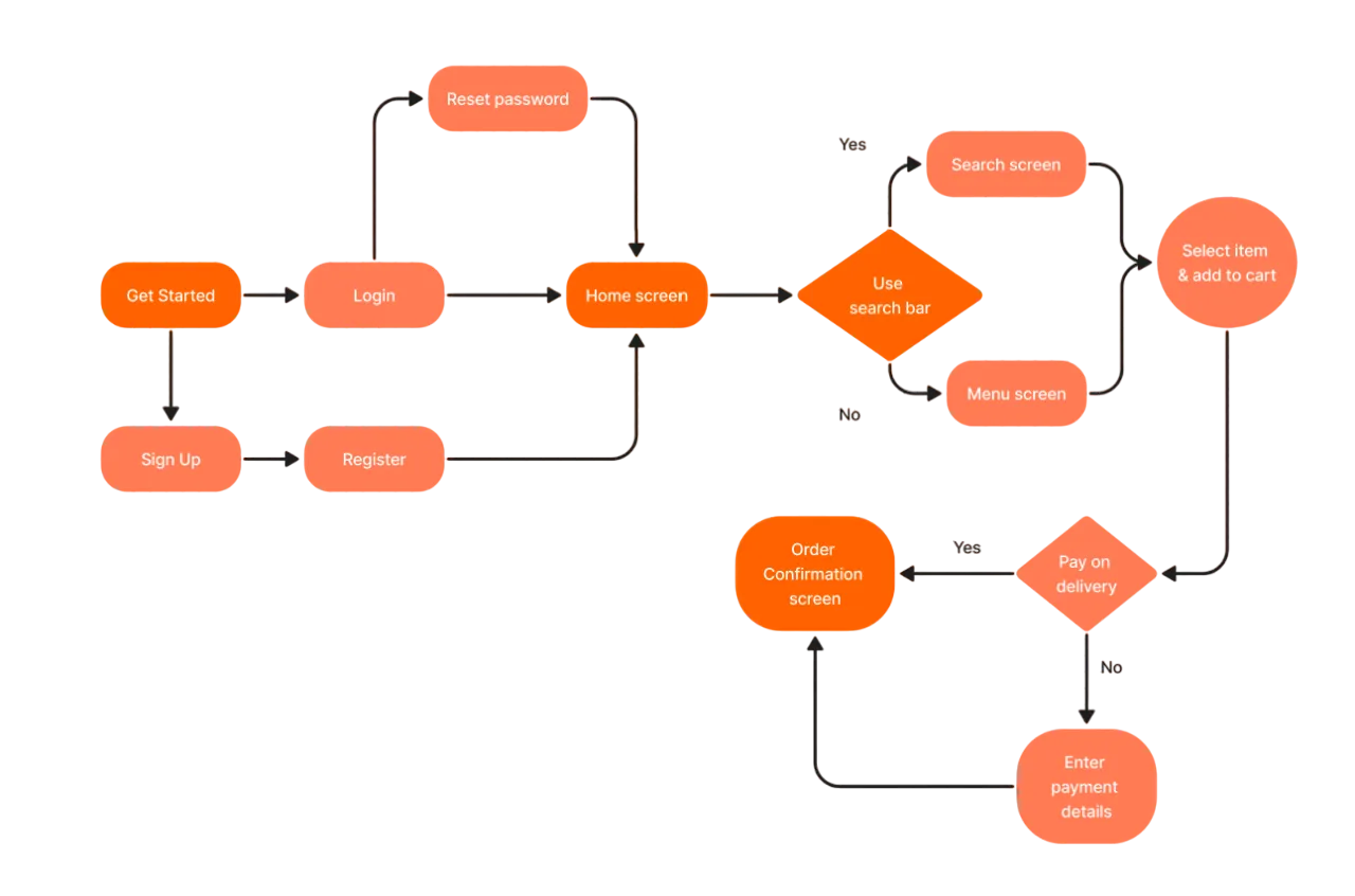
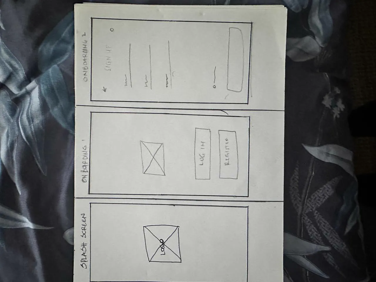
I sketched low-fidelity wireframes of the core journeys and refined them in daily one-hour check-ins with the team, presenting progress and explaining each design decision.
Interface
High-fidelity UI
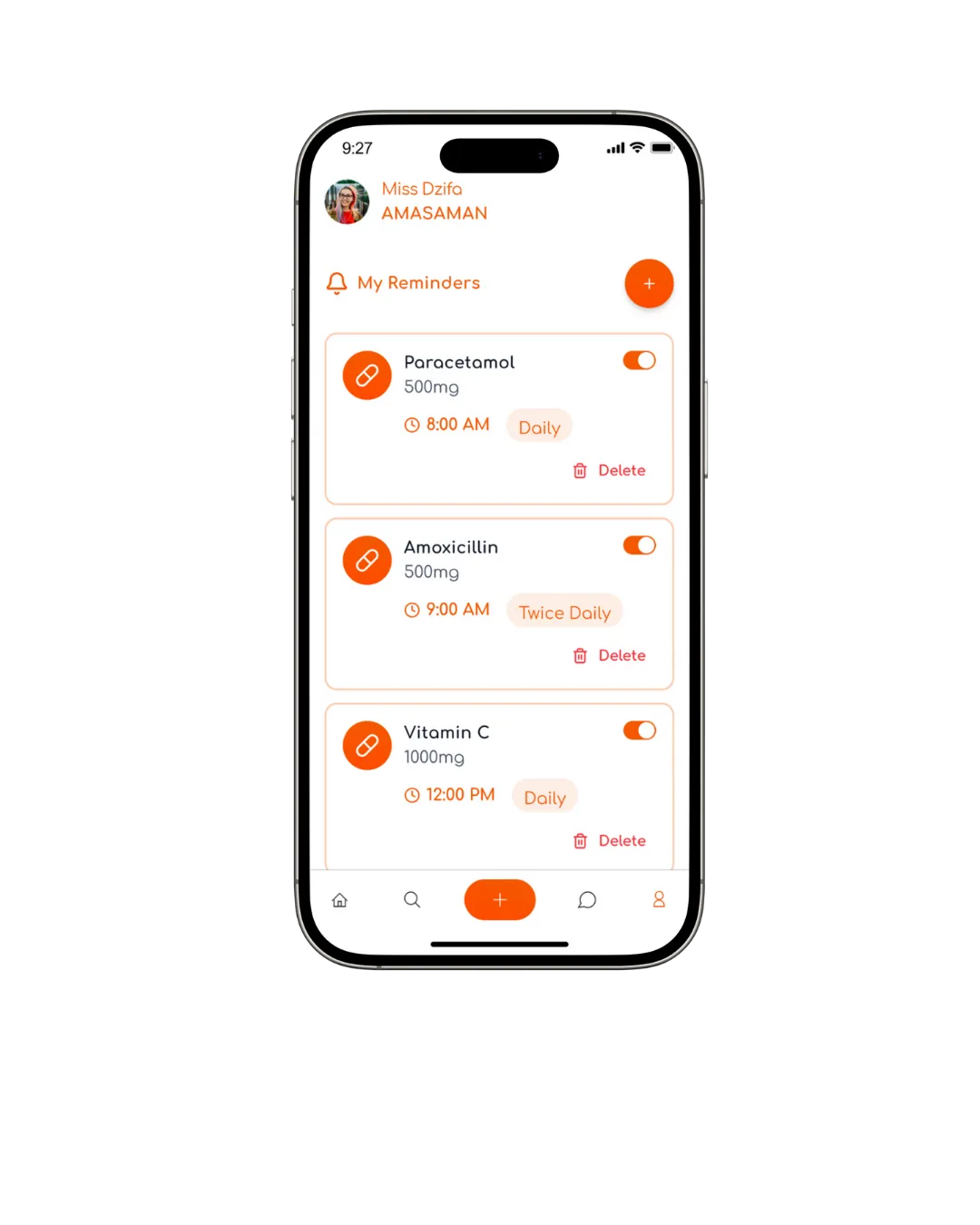
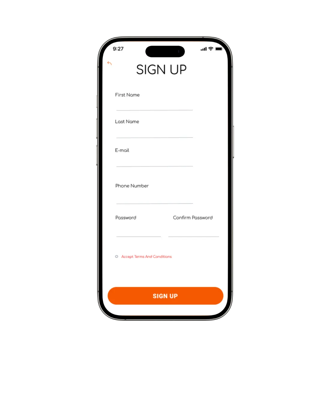
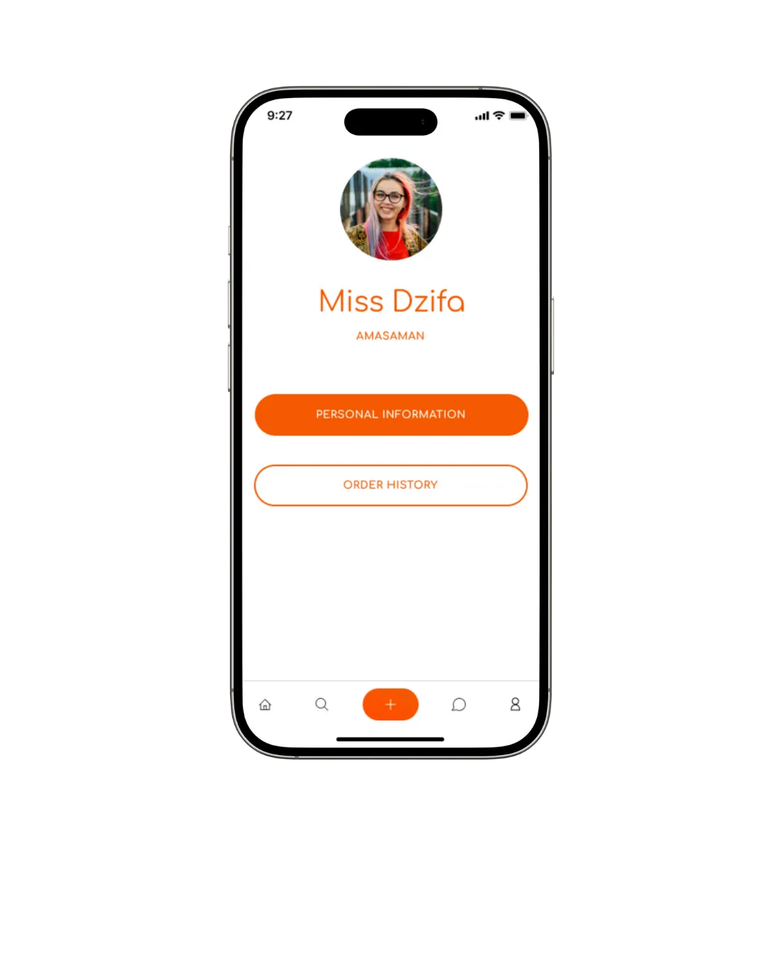
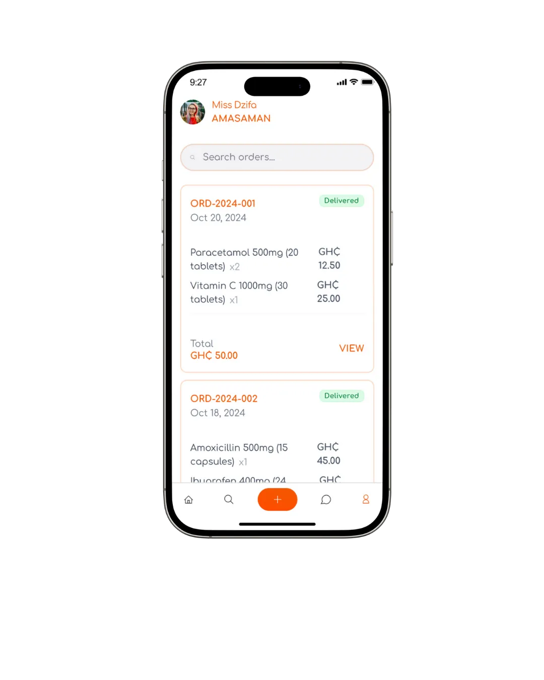
Once the team agreed the colour palette and structure, I designed the high-fidelity screens: big touch targets, one primary action per screen and a warm orange that feels friendly rather than clinical.
Reflection
What I learned
Ntem never launched, but it was my first experience of the full process from research to handoff on a real team. It taught me to design accessibility in from the start, to explain my decisions to non-designers every day, and that in health products, clarity is a safety feature.