
LOGOFOLIO

LOGOFOLIO
Typography/Colour Scheme
"These are a selection of logotypes & marks"
Most were used and others were not


LOGO ANALYSIS
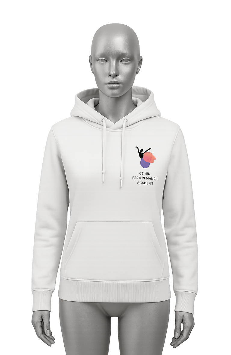
Gemini Performance Academy


Gemini Performance Academy is a vibrant dance academy for young girls aged 3–18. They focus on contemporary dance and explore a wide range of musical styles through dynamic workshops and labs. The logo visually encapsulates grace, fluidity, and expressive motion, hallmarks of contemporary dance
Iconography & Visual Symbolism
Silhouette of a Dancer
The black silhouette of a dancer in an arabesque-like pose captures a moment of elegant motion, immediately symbolizing dance. The raised arms and extended posture convey freedom of movement, confidence and grace, youthful energy and artistic expression
Layered Petal/Flame Shapes
The multi-coloured abstract shapes behind the dancer can be interpreted in multiple symbolic ways:


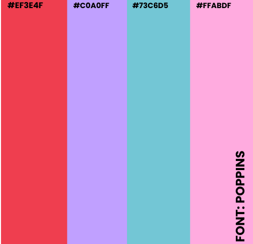
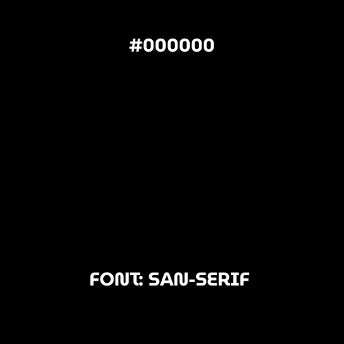
COLOUR PALETTE


Motion Trails: Mimic the flow of fabric or the dynamic trails of movement in contemporary dance and rhythm
Petals: Represent blossoming talent and individual growth fitting for an academy that nurtures dancers from a young age.
LOGO ANALYSIS


YDO Enterprise imports vehicles and parts from Japan, Korea, and China so I designed a logo that captures their strength, reliability, and global reach. Simple, bold, and built to mov just like the brand.
Iconography & Visual Symbolism
YDO Enterprise
The logo features a sleek, front-facing car silhouette in a glowing golden-yellow tone symbolizing motion, energy, and premium quality. The colour choice reflects YDO Enterprise’s commitment to excellence and reliability in vehicle imports, while also giving a modern, high-end feel.
The bold, all-caps serif typography used in “YDO ENTERPRISE” adds a touch of professionalism and authority, balancing the dynamic car outline with a grounded, trustworthy presence. Altogether, the design conveys speed, trust, and a global automotive spirit.
Typography and Design
Front-facing Car Silhouette


Colour Pallete
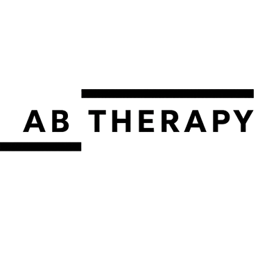
LOGO ANALYSIS
AB Therapy provides accredited CBT and therapeutic counselling, with a focus on calm, clarity, and connection. I designed a logo that reflects that same energy gentle, professional, and grounded. Here’s a look at how the visual identity came to life
Iconography & Visual Symbolism
AB THERAPY
Inspired by the structure and confidence often seen in bold automotive branding like YDO Enterprise, the AB Therapy logo uses strong black lines and a clean sans-serif typeface to convey balance, clarity, and calm. The horizontal bars symbolize support and direction much like a vehicle's steady frame while the crisp, minimal layout reflects a modern therapeutic space that feels both grounded and reassuring. It's a logo that speaks gently, but stands firmly
The black and white palette in the AB Therapy logo reflects clarity, professionalism, and balance. Black conveys strength and stability, while white symbolizes calm and openness together creating a clean, focused design that mirrors the safe, structured space AB Therapy offers.
Typography and Design
Strong Black Lines


Colour Pallete
LOGO DESIGN PROCESS
BRAND MOCKUPS